SUMO SHORTCUTS
ROLE: UI DESIGN
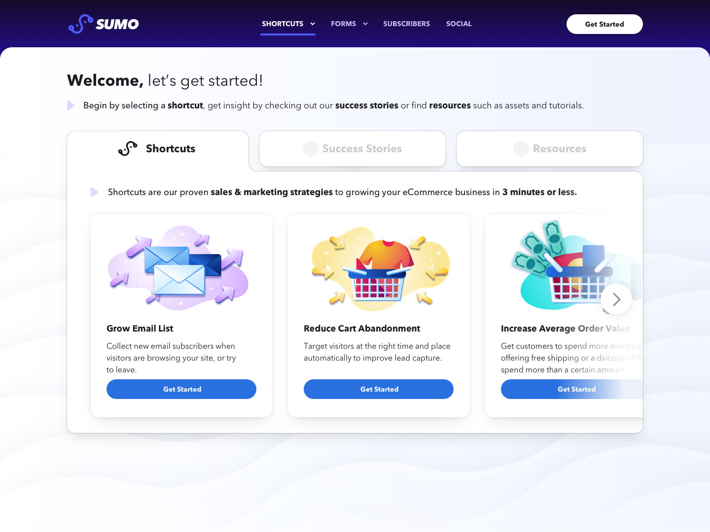
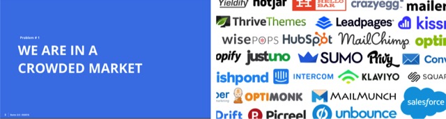
Sumo’s popup creator, Shortcuts, aims to capture web visitor’s email addresses and convert visitors into lifetime customers. The popup creator is outdated, complex, and consists with 2-7% of success rate. The product team attempts to find the next marketing-strategy-in-a-box product specifically designed for the ecommerce stores.
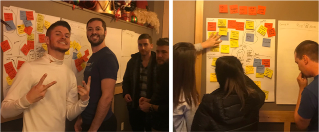
COMPANY WIDE COLLABORATION & WORKSHOP
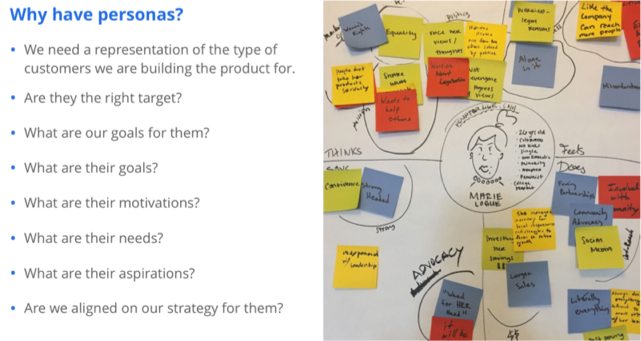
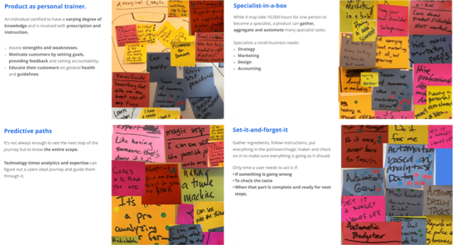
The Sumo Design team conducted the very first company wide design thinking workshop. The goal is to collaboratively come up with the future Sumo products with all teams aligned and excited. We started the workshop with highlighting the importance of design thinking to all the non-UX folks. Then we help them understand Sumo’s current position, create personas they are most familiar with, and then come up with the most needed business tools by their personas. In the end, we consolidated 4 winning ideas and many honorable mentions.
FULL FUNNEL DISCOVERY
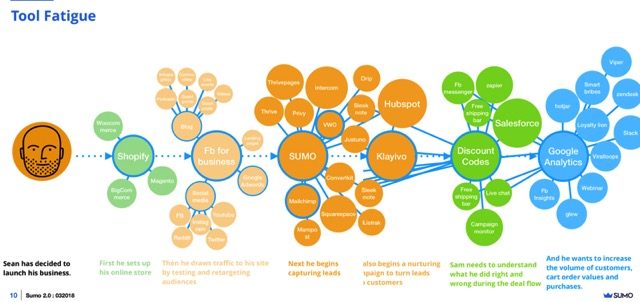
Design team deep dived into Sumo’s current position audit, marketing research and competitive analysis. This helps us to deliberate all teams’ tasks to complete in order to create the best effective marketing strategy in-a-box product.

IDEATION, UX, UI & WHAT'S NEXT
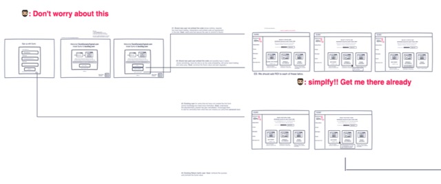
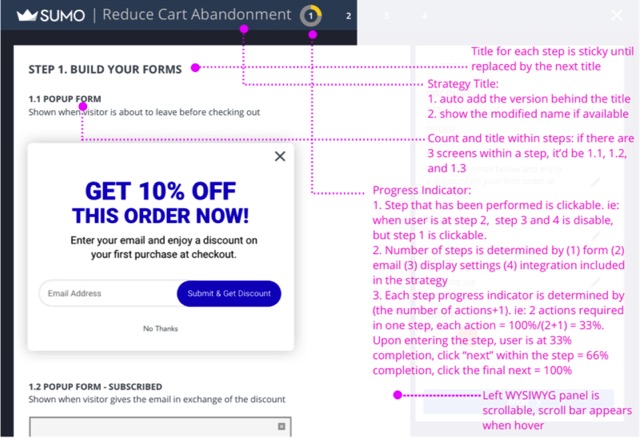
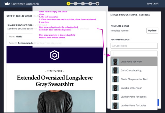
With the new company direction in mind, the design team goes to work. Using Invision Freehand, we come up with various paths and flows in an agile and quick manner. Present them to the product team and discuss the tech feasibility and product alignment. With many revisions, testings, and simplifications, Sumo Shortcuts was created and launched in early 2018. The success rate jumped from the previous 2-7% to 50-75%. Sumo Shortcuts bundles the best marketing strategies and contents into one tool, and in less than 5 steps, user can easily publish the chosen strategy to their site.
UI CREATION
Sumo’s UI was a mismatch of various older products created by many developers and designers throughout its existence. Some attempts had been made in the past to unify the UI, but no official process or guidelines were in place to remedy this.
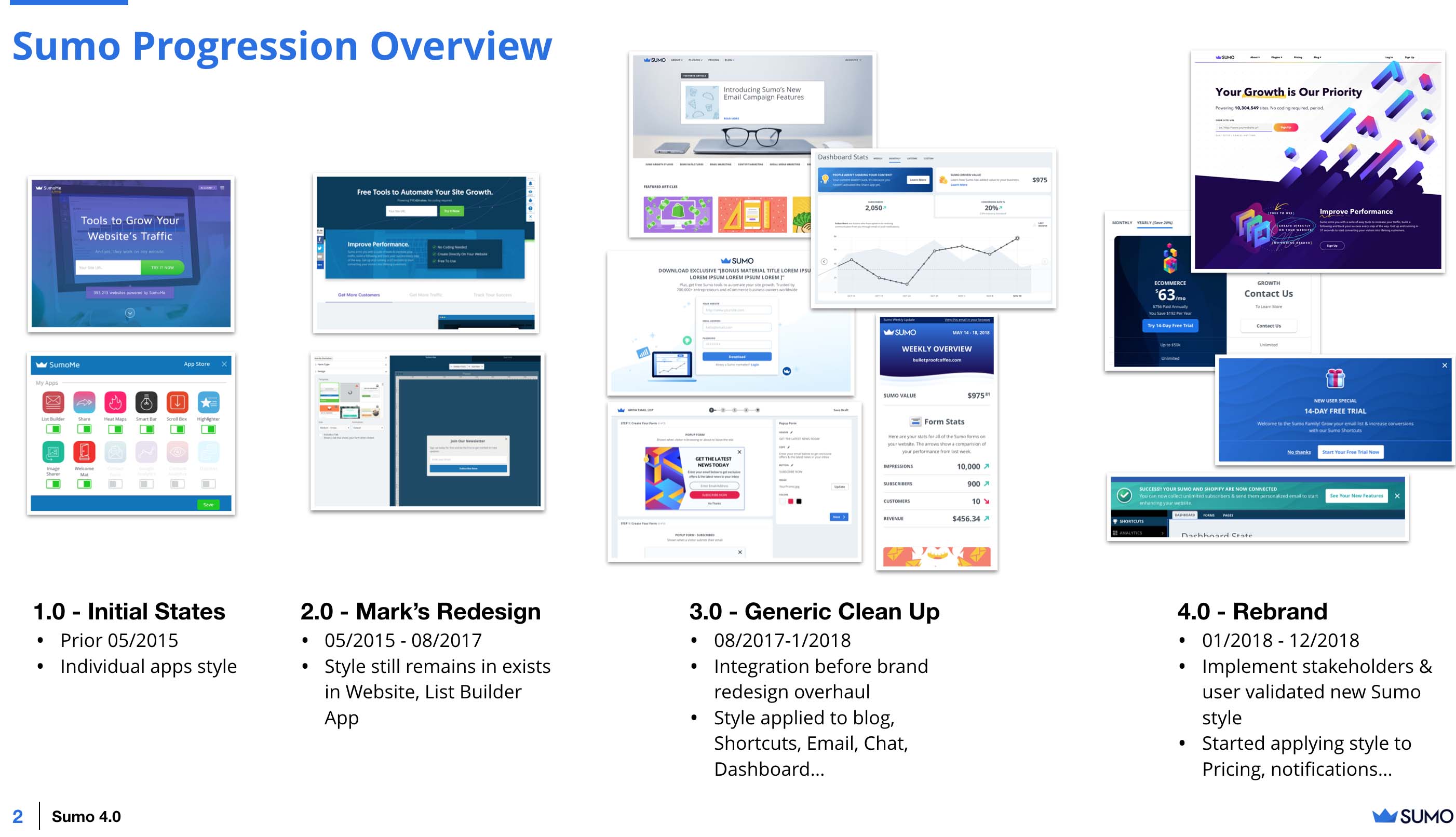
The new direction with Shortcuts allowed us an opportunity to begin considering the components more objectively and thinking more of their long-term use as we created them.
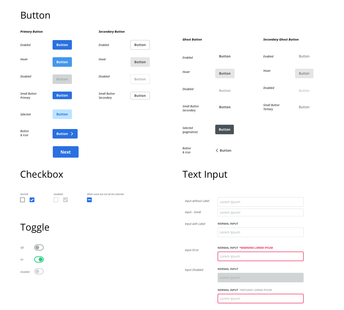
Reusability, efficiency, accessibility, and legibility were emphasized as well as the introduction of guidelines and best practices. Presentations and workshops led by the UI team were done to get the entire product team on the same page. Some of these include the introduction of Atomic Design, an 8pt grid, responsive web design, fluid web design, redlining, design handoff software like Zeplin, and discussions of how it will be implemented. Establishing a common vocabulary and understanding the practices made communicating much easier. This sped up the product delivery process, and made everyone more informed.
Through iteration and constant feedback from UX designers, developers, and the product manager, the UI team crafted finely tuned specs, exported these specs into a design-handoff software known as Zeplin, and documented important notes for developers where necessary. Even after designs mockups are sent off, the UI Designers continue to work together with developers to fine tune the UI further and address limitations and last minute concerns.
Post-launch we eventually went on to implement more features that were seemlessly combined with exisiting features thanks to the great lengths we went through to document and manage our designs.
MORE
Video of Shortcuts in Action
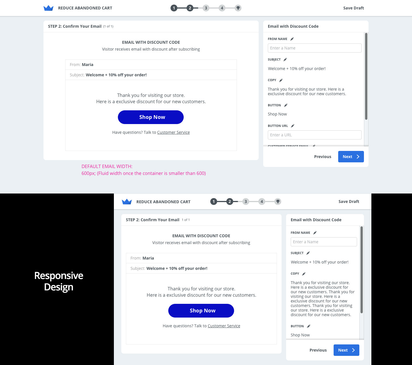
Example of Shortcut's responsive design. Sumo is optimized for small & large work spaces. The right column becomes scrollable and the containers have a max height to prevent important content from being cutoff.
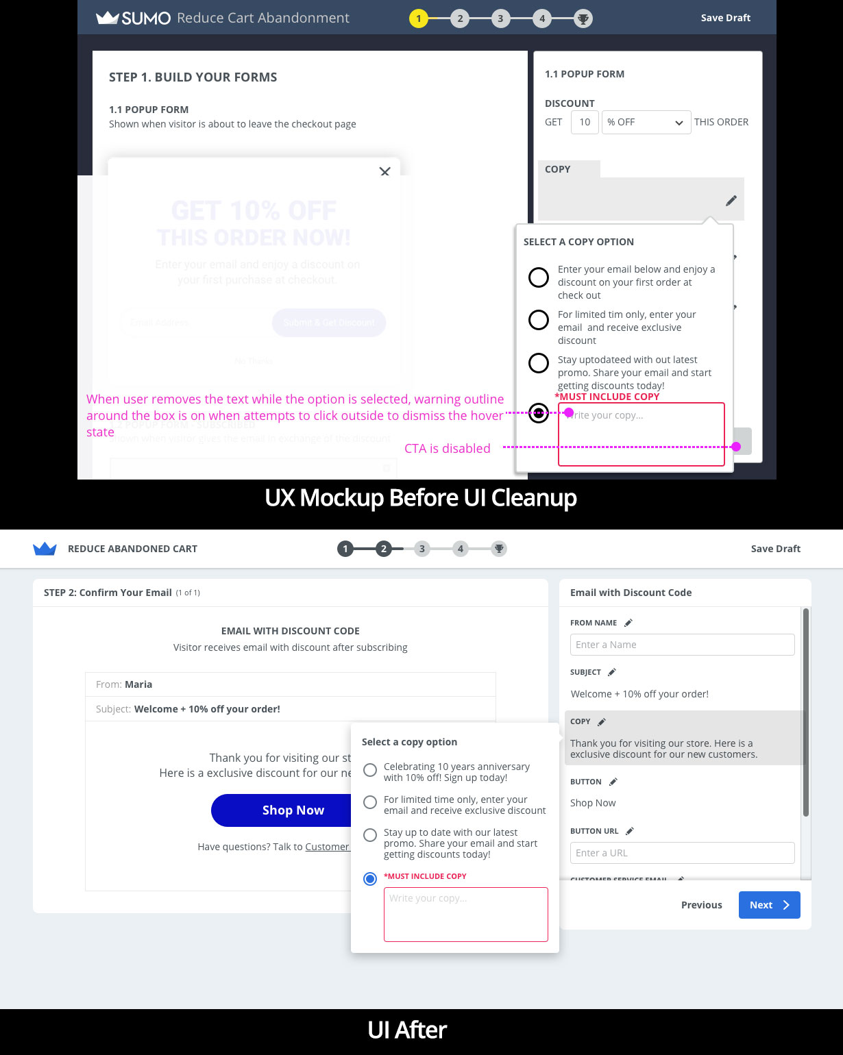
Example comparing the UX mockup to the UI mockup. The UX & UI Designers worked closely together to make a final UI that doesn't lose the intention behind the early UX mockups.
What a Shortcuts 2.0 could be.